How Customers Actually Shop Gift Displays
Most gift displays don’t fail because the products are wrong. They fail because the way customers actually see and process them has been misunderstood. In physical retail, attention is not evenly distributed, rational, or even particularly patient. It’s fast, selective, and driven by visual shortcuts the bran uses to reduce effort.
Understanding this is where visual merchandising moves from “arrangement” to performance strategy. Eye-tracking research in retail environments shows that customers don’t browse shelves evenly - they scan, filter, and only engage deeply with a small fraction of what is in front of them. For retailers, this has direct implications for conversion, dwell time, and basket value.
How customers actually look at gift displays
When a customer approaches a fixture, they don’t “read” it like a catalogue. Instead, they scan in quick, predictable patterns. They first few seconds are dominated by peripheral vision and contrast detection, not product evaluation.
Typically, the process looks like this:
- Initial scan (0-2 seconds): The brain registers shape, colour contrast, lighting, and movement.
- Attention capture phase: The eye is drawn to the most visually dominant element, not necessarily the most important product.
- Engagement phase: Only then does the customer slow down and begin assessing price, relevance, or gifting suitability.
- Decision point: A single item or small cluster is selected for closer inspection.
This matters because most gift displays are built as if customers will methodically evaluate everything in front of them. In reality, 90-90% of SKUs in a display may never receive meaningful attention unless they’re visually “pulled forward” through hierarchy, contrast, or placement.
This is where well-positioned gift display stands, POS signage, and themed visual merchandising accessories can significantly improve product visibility. This is the foundation of effective retail psychology: you’re not presenting products equally, you’re staging attention.
Why customers ignore centre displays (even though they shouldn’t)
A common assumption in merchandising is that the centre of a display is the “prime zone”. In practice, centre placement is often overestimated and underperforming.
The reason is simple: the human brain doesn’t prioritise symmetry or centrality - it prioritises differentiation. If a centre display lacks contrast or standout cues, it becomes part of the background pattern rather than a focal point.
Several factors contribute to this:
- Visual blending: If products are evenly spaced and similarly packaged, the centre loses definition.
- Expectation fatigue: Shoppers subconsciously expect centre zones to contain “more of the same”, so attention shifts outward.
- Competing stimuli: End caps, lighting features, signage, and adjacent aisles often outperform centre fixtures in capturing attention.
- Cognitive filtering: Once the brain identifies a display as “understood”, it stops actively processing it.
For retailers, this is critical. Centre positioning only works when it’s earned visually. Strong contrast, vertical disruption, hero products, or thematic grouping are required to make the centre a true focal point rather than a visual midpoint.
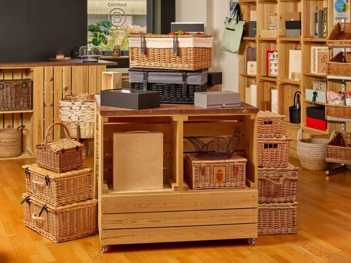
Many retailers achieve this using elevated display risers, bestselling seasonal gift collections, or premium feature displays designed to create stronger focal points.
Why waist-height beats eye-level for gift products
One of the most consistent findings in retail merchandising is that the most commercially effective zone is not eye level - it’s waist to chest height. This “golden zone” performs better for one key reason: ease of interaction drives engagement.
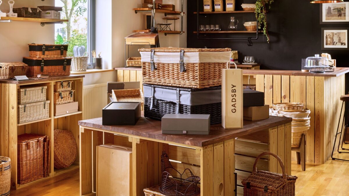
Customers are significantly more likely to pick up, rotate, and evaluate products that sit within natural reach. That physical interaction is often the tipping point between passive browsing and purchase intent. This is why many retailers use countertop display units, modular shelving systems, and accessible gift merchandising fixtures with high-interaction zones.
Eye-level placement, while useful for visibility, has a different role:
- It supports awareness and scanning
- It’s effective for brand blocks or signage
- It’s less effective for conversion-driven gift selection
Wait-level positioning, by contrast:
- Encourages tactile interaction
- Reduces physical friction
- Increases dwell time per product
- Improves perceived accessibility and relevance
For gift retail specifically, this matters because gifting decisions are often emotional and sensory. The more a customer can handle a product, the more real the purchase becomes. This is why high-performing gift fixtures tend to prioritise “reach-and-touch” design over pure visibility.
How many products is too many? The choice paralysis threshold
One of the most expensive mistakes in gift merchandising is over-assortment. While it feels intuitive that more choice equals more sales, behavioural economics consistently shows the opposite beyond a certain point.
This is known as choice overload or decision fatigue.
When customers are presented with too many similar options:
- Decision time increases
- Confidence in choice decreases
- Perceived risk increases
- The likelihood of walking away rises
In gift environments, where decisions are often quick and low-involvement, this affect is amplified.
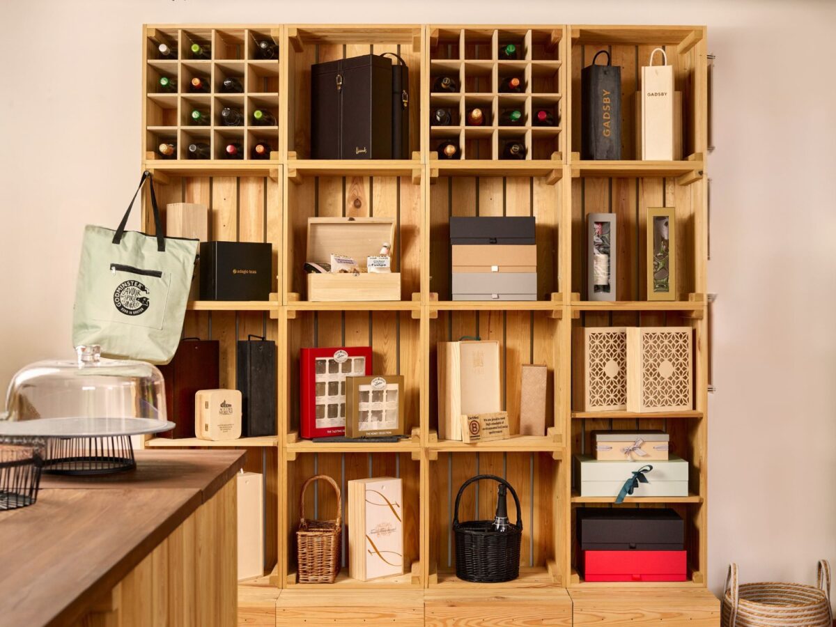
The key issue isn’t variety itself, but lack of structure within variety. A dense display of 30 loosely related items is far less effective than 12 clearly grouped and differentiated options. Well-curated gift collections, themed product edits, and clearly segmented retail display solutions often outperform oversized assortments because they simplify decision-making.
Effective gift displays typically follow these principles.
- Limit visible SKUs per micro-zone
- Group products by occasion, recipient, or price tier
- Use clear visual segmentation to reduce comparison load
- Ensure each group has a “hero” product to anchor attention
In practical terms, if a customer has to stop and think, “where do I start?”, the display is already working against conversion.
Practical takeaways for improving gift display performance
For retailers and merchandising teams, improving performance doesn’t require more product - it requires better control of attention.
Key principles include:
- Prioritise waist-height placement for high-margin of hero gift SKUs
- Reduce visual noise by limiting SKU density per display zone
- Use contrast deliberately (colour, scale, lighting, shape) to guide attention
- Avoid over-reliance on centre placement unless visually reinforced
- Structure assortments in clear, digestible groups to reduce cognitive load
- Design for interaction, not just visibility
- Use themes merchandising accessories and clear POS display signage to reinforce visual hierarchy
- Refresh seasonal display collections regularly to prevent visual fatigue
- Support hero products with layered retail display fixtures or elevated presentation
These changes are often incremental, but the impact on conversion can be significant because they align with how the customers already behave - not how retailers assume they behave.
Conclusion: retail performance is attention management
At its core, effective gift merchandising is not about filling space - it’s about directing attention with precision. Eye-tracking logic makes one thing clear: customers don’t see everything, and they don’t evaluate everything equally.
They scan, filter, and respond to visual cues that signal relevance, ease, and reward. When gift displays are designed with this in mind - through smart placement, controlled assortment, and intentional hierarchy - they become significantly more effective sales tools.
For retailers, this is the shift: from product presentation to attention engineering - using smarter merchandising, curated gift collections, and effective retail display solutions to guide customer behaviour more intentionally.
Return to the Retail Display E-Learning Hub.