


Why Your Displays Look Busy & How to Fix It
A well-stocked shop should feel inviting, inspiring, and full of things customers want to discover. But there’s a fine line between a display that feels abundant and one that simply feels busy.
If customers are faced with too many products, colours, and competing focal points, even your best products can struggle to stand out. And while the instinct might be to invest in new shelving, tables, or display fixtures, the solution may actually be much simpler...
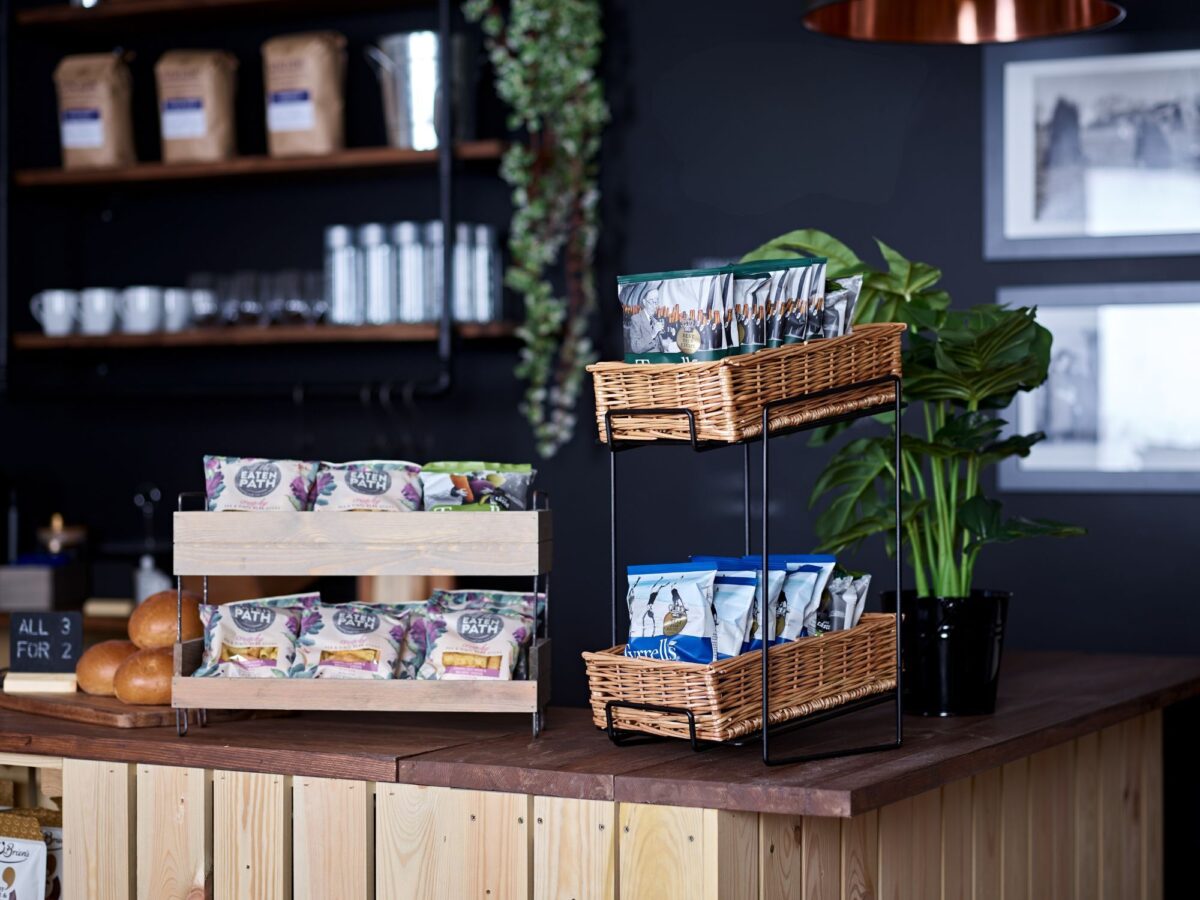
Often, the best way to improve a retail display is to edit what you already have.
Here are some simple visual merchandising techniques that independent retailers can use to create more considered, effective displays without buying new fixtures.
Visual noise vs abundance
There’s nothing wrong with a well-stocked retail display. In fact, a sense of abundance can communicate choice and encourage customers to browse.
The problem starts when everything is competing for attention.
Visual noise can come from too many colours, products overlapping one another, inconsistent product groupings, or trying to use every available inch of space. When there’s no obvious focal point, the customer’s eye has nowhere to go.
A strong retail display creates hierarchy. There should be something that catches the eye first, followed by supporting products that encourage the customer to explore further.
The useful question to ask is:
What do I want my customer to notice first?
Colour is one of the quickest things customers notice, so inconsistent colour groupings can make a display feel more chaotic than it actually is.
Rather than spreading similar products across an entire shop, try grouping complementary colours. Natural, neutral, and earthy tones can work particularly well when creating a calm backdrop, while strong colours can be introduced selectively to draw attention to particular products or collections.
This doesn’t mean everything needs to match. Instead, think about creating visual relationships between products.
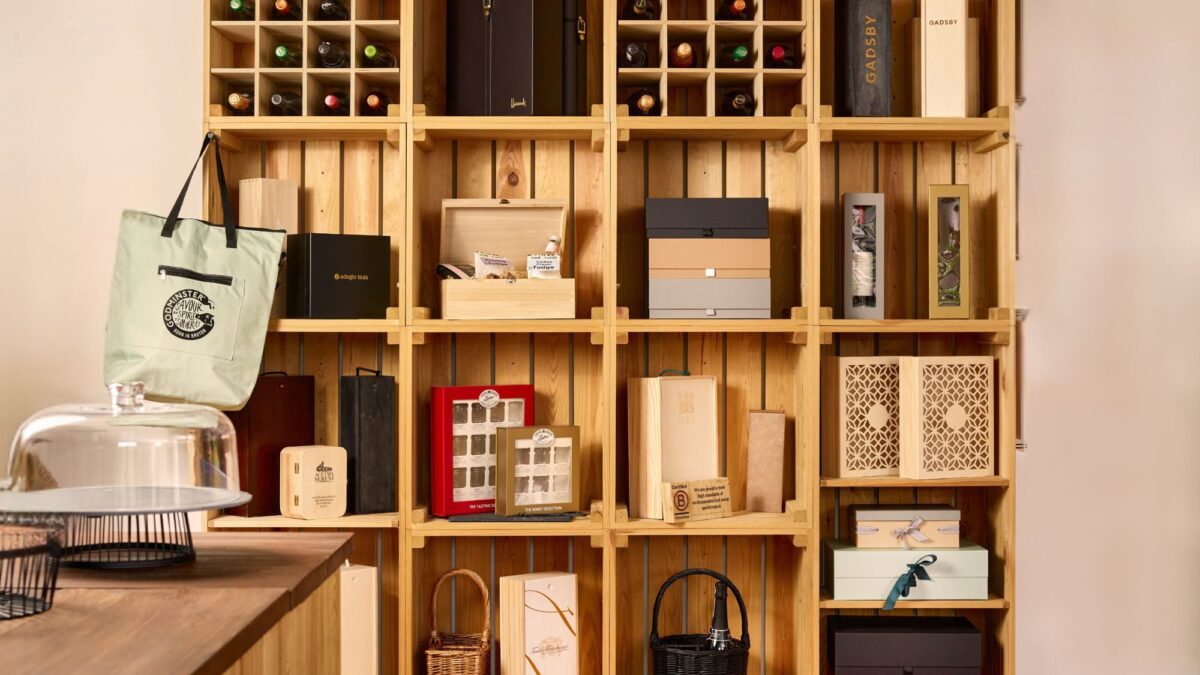
For example, a collection of neutral gift boxes could sit alongside natural-toned baskets, with a small amount of greenery or a complementary colour providing contrast.
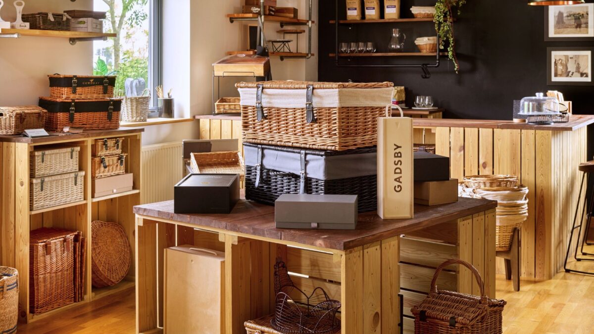
The same principle applies to retail displays using baskets, trays, and risers. The display fixtures themselves become part of the colour story, so choosing natural materials can help create cohesion without distracting from the products you’re selling.
Why do baskets get overloaded?
Baskets are incredibly useful for retail merchandising. They can group products together, introduce different heights and textures, and make a collection feel more approachable.
But there is a temptation to fill them.
If a basket is overflowing with products, customers may struggle to see what is actually inside. Smaller products can disappear, individual items become difficult to pick up, and the basket itself can lose its visual impact.
Instead of asking, “How much can I fit in this basket?”, ask: “How can I make the products inside easiest to shop?”
Try grouping products according to a clear theme, purpose, or customer need. A basket might become a dedicated self-care collection, a breakfast selection, or a seasonal gifting display rather than simply a container for excess stock.
Leaving a little space around the products can also make the contents feel more considered. You don’t need to fill every basket to the brim to make a display feel plentiful.
Give premium products room to breathe
One of the most overlooked tools in visual merchandising is also one of the simplest: space.
Space isn’t necessarily wasted space. Used deliberately, it gives the customer’s eyes somewhere to rest and helps important products stand out.
This is particularly valuable when selling premium or higher-value products.
Consider the difference between one beautifully presented product surrounded by space and the same product squeezed between 10 others. In the first display, the product becomes a focal point. In the second, it can simply become part of the clutter.
This is why premium retail environments often resist the temptation to fill every available surface. Space can communicate confidence and allow individual products to carry more visual weight.
Use height to create structure
Display can also feel busy when everything is presented at the same level.
You don’t necessarily need a new shelving unit or specialist fixture to create height. Look at the products and display pieces you already have and consider how they can be layered.
Display risers are particularly useful for bringing smaller products into view, creating a strong focal point and breaking up a flat arrangement.
Wooden trays can also help define individual product groupings while adding another level of texture and structure to a display.
The aim isn’t to create as many different heights as possible. Instead, use height intentionally to guide the eye through the display.
Edit before you add
If a display isn’t working, the first instinct is often to add something. Another fixture, another shelf, another basket. Before doing that, try taking something away.
Remove 10-20% of the products and see what happens. You may find that the remaining products become easier to see, the display has a clearer focal point, and customers can navigate it more easily.
You can then use the space you’ve created to separate product groups, introduce a little height, or simply allow a hero product to stand out. This is particularly useful for independent retailers, where display space can be limited, and every fixture needs to work hard.
A 30-minute retail display reset.
If your shop is feeling particularly cluttered, set aside 30 minutes and work through these steps:
- Stand back. Look at the display from the position of a customer entering the space.
- Choose your hero. Decide which product, collection, or message should attract attention first.
- Remove something. Temporarily take away a selection of products and reassess the space.
- Group different levels. Use existing products, trays, baskets, or risers to introduce height.
- Leave some space. Don’t automatically fill every gap.
- Look again. Can you understand what the display is selling within a few seconds?
Better displays don’t always require more fixtures
Effective visual merchandising isn’t necessarily about having more space, more fixtures, or more products. It’s about making better use of what you already have.
By grouping products carefully, controlling colour, avoiding overloading baskets, and introducing intentional space, you can create retail displays that feel calmer, easier to shop, and more focused.
And if you’re selling premium products, that breathing room can be valuable. So before investing in another fixture, try something simpler:
Take something away. Gift your best products some space. Then see what your customer notices first.
Return to the Retail Display E-Learning Hub.